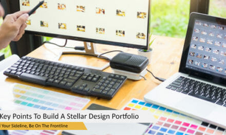
Your business’s name plays a huge role in its success, but what secures that path is the logo you design to represent your brand visually. Companies like Apple, Coca Cola, and Nike are among the iconic companies that can mostly associate their status with easily recognizable logos.
I’m pretty sure that’s the level you wish your startup could reach. Find out how you could get there by exploring the meaning behind a few famous logos.
What is a Business Logo?
Entrepreneur defines a business logo as “A recognizable graphic design element, often including a name, symbol or trademark, representing an organization or product.” In short, your business logo is not just some image you throw into your platforms and attach to your brand name.
Your company logo is an embodiment of what your brand is all about–what it has to offer, its principles, story, goals, etc. So designing a business logo is pretty challenging. How will you put all of that in a small icon anyway?
To give you a little idea, here are a few popular logo types that make the mission possible:
Logotypes
Logotypes are word-based logos that spell out the brand’s name in colorful and playful fonts. A few examples are Home Depot, Barbie, Volvo, and Canon.
Lettermarks
Lettermarks are almost the same as logotypes, only that these only use a letter or initials. The most impressive example of this is Toyota’s logo.
The Japanese business logo is an emblem of all the letters of the company name. You can see the “T” from that logo, and the surrounding elements are the rest of the letters that entirely spell out Toyota. I bet you didn’t notice that until now!
Pictorial Marks
Pictorial marks are icon-based logos without any text. Mitsubishi, another huge Japanese brand, is the perfect example of a pictorial mark.
The literal translation of Mitsubishi in Japanese is “three diamonds” (“mitsu” = three; “bishi” =diamonds). So I guess that solves another mystery for you, as I know the Mitsubishi logo kind of looks like a wind turbine or just something random.
Abstract
Abstract logos are the same as pictorial marks, only that the images are unique and could represent a wide range of things. Nike is the ultimate abstract logo.
The swoosh has multiple meanings behind it that represent the personality of the brand. Here are its first depictions before we’ve regarded it as the “Just do it” motivational symbol:
- Conveys motion and speed
- Wing of the famous Greek Goddess of Victory, Nike
Combination Logos
This type is a fusion of icons and words. Adidas is a combination logo with its lowercase brand name under the three-striped mountain shape or the original Tri-foil.
Guidelines for Creating a Great Logo
Now that you’ve learned about the options in designing your logo, let’s move on to the planning stage. As a startup, you need to take a step-by-step procedure in identifying which logo would represent your brand on various marketing platforms.
By now, you’ve probably realized how complicated it is to put your brand’s entire character in graphics. So we’ve simplified the planning process for you.
Have a Solid Brand Identity First
It’s natural for a startup to not have a solid brand identity right off the bat. However, you have to work on this as soon as possible to determine what your logo should represent.
Knowing your brand identity is also vital in maintaining a consistent service for consumers. People these days are looking for character in brands, and the only way you can emulate that is if you know who you are as an enterprise.
Once you accomplish this first step, you’ll have a clear idea of what you want your logo to symbolize.
Know Your Audience
Starting a business is like getting in a relationship. If you don’t know yourself enough, you won’t be your best at it. If you don’t know the other person in the relationship, then you won’t know how to make it work.
Your significant other in business is your audience or target customers. You have to know them well so that you’ll understand what visually appeals to them. For example, if your business caters to corporate groups, you don’t want your logo looking like it isn’t professional at all.
Analyze Your Style
Analyzing your style means assessing what you like and don’t by checking out the trends in logo design. Here are the logo design trends for 2019:
- Bright Colors
- Multi-color Gradients
- Metallic Logos
- Geometric Shapes
- Minimalist Illustrations
- Minimalist Typography
- Creative Logotypes
- Illustration Substitutes for a Letter
- Artistic Logos and Illustrations
You have to make sure that you plan your startup’s logo according to the trend in that year. This strategy will seamlessly insert your brand into the industry and get as much attention as possible.
However, Callum Humphreys, Creative Director of Creato Design Sydney, says “It is important to note that although logo design trends vary from year to year, the basic philosophy of logo design never changes: to build a mark that customers will recognize, resonate with and instantly understand its message.”
Determine Your Budget
Everything has to be on the budget when managing a startup, so it’s essential to not go overboard in spending for a logo. Google, Coca Cola, and Microsoft even had their logos made for $0. Twitter’s logo also only cost them $15.
I’m not saying don’t pay your graphic designer or lowball their services. However, there are a few ways of getting a great logo for an affordable cost. Here’s how:
In-House Designing
Frank M. Robinson, founder’s partner and bookkeeper of Coca Cola designed the company’s classic logo in 1886. That’s why it didn’t cost the company anything. If you know someone who can create an excellent logo for free, you can always grab that option.
Also, if you have the skill yourself, that’s even better. That would allow you to craft the logo just the way you want it. You don’t have to be a professional in creating an emblem anyway. Just watch a few photoshop YouTube tutorials, study the trends, and you’re good to go.
Hiring a Freelancer
Hiring a freelance graphic designer is the cheapest option in getting your logo done. Freelancers offer more affordable rates compared to graphic designers who work in a firm. Still, they produce the same quality of output.
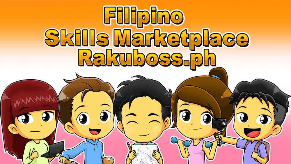
You can also easily connect with them. These graphic designers sell skills in a freelance marketplace in the Philippines called Rakuboss. Many other freelancers from various fields also sell sidelines there.
The good thing about hiring a freelancer to design your logo is that you can negotiate rates and terms with them freely. You also get to coordinate with them the entire time they’re working on it. Hiring a graphic designer from a firm often makes it challenging to ensure you’re both on the same page.
Characteristics of a Killer Logo
You already know how to get your logo done, but you still probably don’t know how to tell a full-potential one. Whatever icon you make by heart or anything a graphic designer produces can look aesthetically pleasing but still lack effectiveness.
Your business logo is not just an image to satisfy your target audience’s eyes. You need your logo to capture their attention and convince them to support what you’re offering. Here are the qualities that make a great brand logo:
Simple
The most successful logos in the world have always been simple. Company logos like Mcdonald’s, for instance, has a straight-forward logo that has engraved itself in our heads. Apparently, there’s a psychology trick behind basic logos.
Sammy Blindell from How-to Build a Brand explains, “It [simple logo] is easier to associate with positive experiences because it triggers crucial memory centers in the brain, rather than confusing the brain with unclear messages, or overloading it with too many messages.”
Functional
As I’ve mentioned, your logo has to serve a purpose other than making it attractive to people. You need your brand icon to accomplish the following goals:
- Differentiate your brand from the competitors
- Express quality and good service
- Communicate the message you want to relay (e.g., your passion, signature, etc.)
Versatile
Your logo has to fit different marketing materials and channels. You can’t have a business logo that looks good as a full image but not as a thumbnail.
A versatile logo should look great even in different colors, sizes, and mediums without losing its original shape, icon, font, and other trademark elements. Forbes cites The Word WildLife Fund logo as a success in this area.
If you’re making your logo, you have to make an in-depth study of the following components of logo versatility:
- Space
- Color
- Font
- Gradients
- Shapes
- Size
It would be fun to explore all of those facets that make a versatile logo. However, it is still advised to hire a graphic designer. They are an expert in playing with those items, and they get the job done quicker and more accurate.
Memorable
Of course, the ultimate purpose of your business logo is to create an impact. The key ingredient in designing an unforgettable logo is uniqueness.
However, the previous qualities are still huge contributing factors to a logo’s notability. Many experts enumerate simplicity, versatility, and functionality as factors that make any logo memorable.
Over and Out
Consumers only take 10 seconds to make an initial impression of a brand’s logo. Then it takes 5-7 impressions to recognize it. Now, this is not to pressure you into choosing the perfect logo for your business.
These statistics show the power you have in your hands to create a fruitful bond with your consumers. Recognition plays a significant role in marketing these days, and you should enjoy this creative way of achieving that.
With this guide I’ve pulled together, I’m sure you’ll have a great time designing your iconic business logo.